Typography
Primary Typeface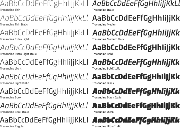
Our primary typeface for communications materials is the Trasandina family. Trasandina is a versatile, modern sans with a technological edge that also features humanistic elements which make it friendly to the reader. It complements our logo wordmark while allowing the wordmark to remain distinct.
Transandina is a licensed font included with the Adobe Creative Suite, and cannot be installed on user's computers without a license.
Alternate Typeface
The preferred alternate font is Titillium Web. For applications such as Word documents and PowerPoint presentations, it is best to use a common, pre-installed font to ensure the integrity of the text and layout. In these instances, use the Arial font family for any text. Avoid using any other pre-installed fonts except for Arial. This will maintain a level of consistency in these applications.

Headlines
Headlines should almost always be set in Trasandina Black, in PMS 266 when possible. In general, headlines paired with body copy should be about 30-40% larger than the body copy size. Subheads may be set in all caps.
Body Copy
Body copy is the basis for any baseline grid. Use the size and leading of body copy to determine the size of the rest of the text elements. Most body copy should be set in Trasandina Regular or Book, between 9pt and 11pt, depending on the audience. When reversing type out of a colored background, increase the weight to Regular or above. Body copy should almost always be 100% black. Only small areas of bolder text can use another color while remaining easily readable and clean in both print and digital media.
Pull Quotes and Callouts
The hexagon element functions a simple but strong focal point for a pull quote when combined with the heavier italic weights of Trasandina. Aim for shorter phrases that take up no more than five lines, centered vertically and horizontally in the hexagon. Type should look proportional to the shape. For longer pull quotes and callouts, use lighter weights of Trasandina at larger sizes to differentiate these blocks from any headlines.
Large Format
When using Trasandina at an extremely large size relative to the whole design, use Regular or Medium weights to prevent the text from overwhelming the composition.
Pre-Installed Fonts
For applications such as Word documents and PowerPoint presentations, it is best to use a common, pre-installed font to ensure the integrity of the text and layout. In these instances, use the Arial font family for any text. Avoid using any other pre-installed fonts except for Arial. This will maintain a level of consistency in these applications.